Primary use
Navy backgrounds, white content areas, green primary actions, blue support links, slate body copy.
Brand Kit
Every page, video, post, ad, and design handoff should feel like the same company: a local team that shows up prepared, explains the options clearly, and protects the homeowner from confusion.
Color system
Raptor's recognizable blue and green should stay sharp. The premium version uses deep navy for authority, white for clarity, blue for guidance, green for decisive action, slate for readable text, and orange only for urgent storm or warning moments.
#071224#14345F#0EA5FF#39FF14#EFF8FF#FFFFFF#64748B#FF8A00Navy backgrounds, white content areas, green primary actions, blue support links, slate body copy.
Green should mark the next step. If everything is green, nothing feels important.
Text must stay readable on mobile, in sunlight, and in screenshot reviews. Avoid low-contrast gray on pale blue.
Typography
The current site already uses a strong pairing. Keep Space Grotesk for high-confidence headings and Manrope for body, navigation, buttons, forms, and practical guidance.
Headings: Space Grotesk
Body: Manrope
Raptor copy should feel like a capable project lead walking a homeowner through the next decision. It should be easy to scan, calm under storm pressure, and specific enough to be trusted.
Logo and mark
Use the full Raptor Roofing logo in headers, footers, proposals, and branded guide pages. Use the icon mark for favicon, social avatar, small review states, and compact internal Raptor Brand Kit labels.
Use when the viewer needs immediate brand recognition.
Use for compact states, review chips, favicons, and system markers.
Voice
Raptor should never sound like a generic contractor directory or a pressure-heavy storm chaser. The voice is practical, local, reassuring, and specific.
Say what the homeowner should do next, what Raptor will inspect, and what happens after the appointment.
Use confident language backed by process, documentation, crew experience, and project examples.
Reference Central Indiana weather, neighborhoods, roof types, drainage, and homeowner concerns naturally.
Let the team feel present. Use people, roles, jobsite details, and real service behaviors.
Use language like this
Avoid language like this
Imagery
The best imagery shows organized crews, branded trucks, completed homes, material details, roof systems, team culture, and local context. Stock-style images should be rare and must never replace available Raptor proof.
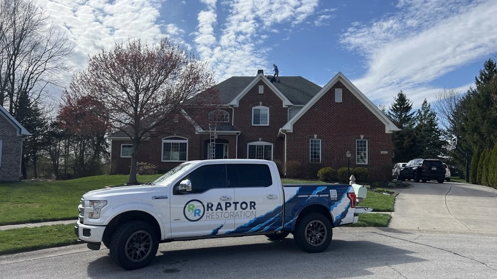 Branded Presence
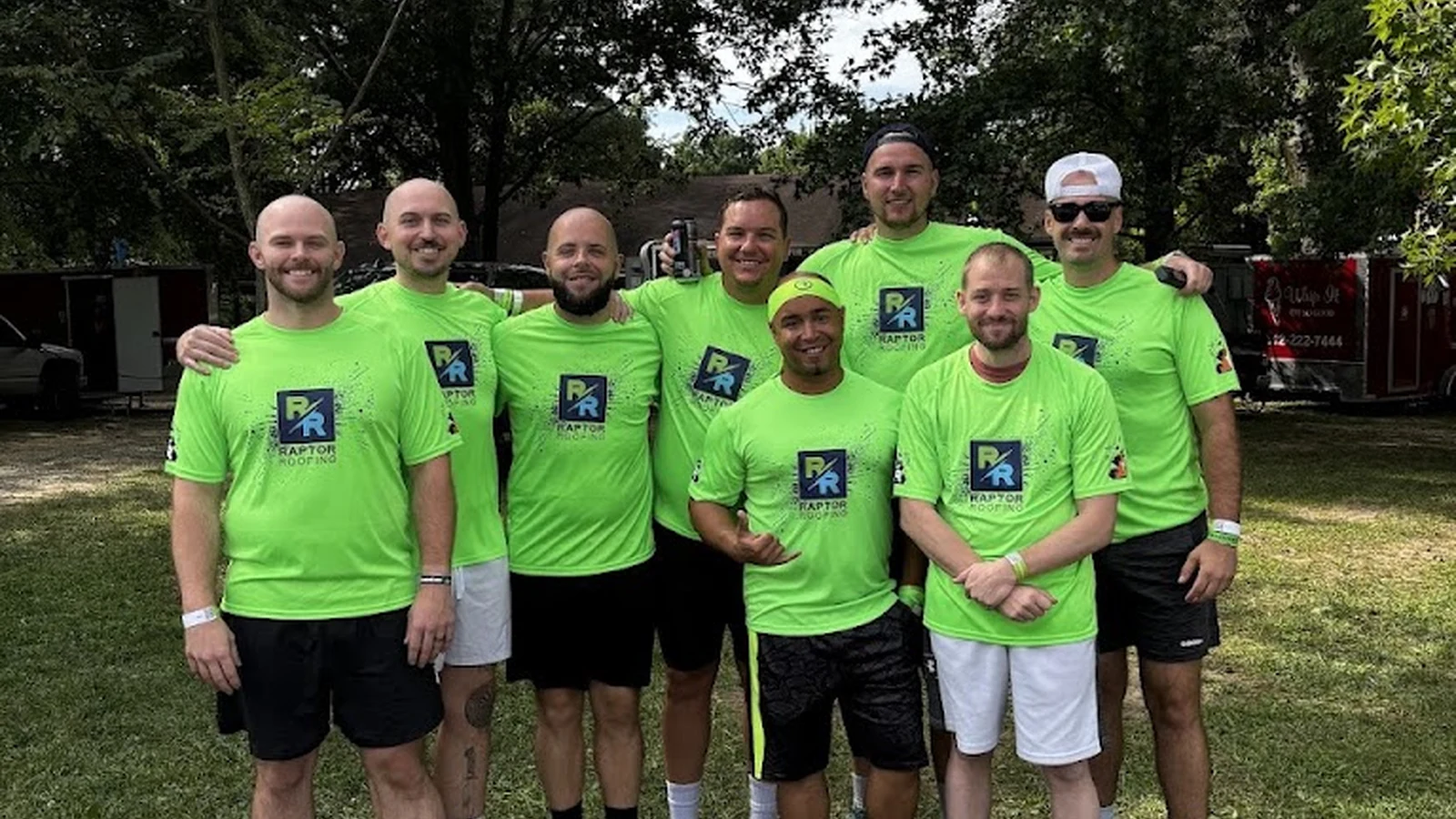 Local Team
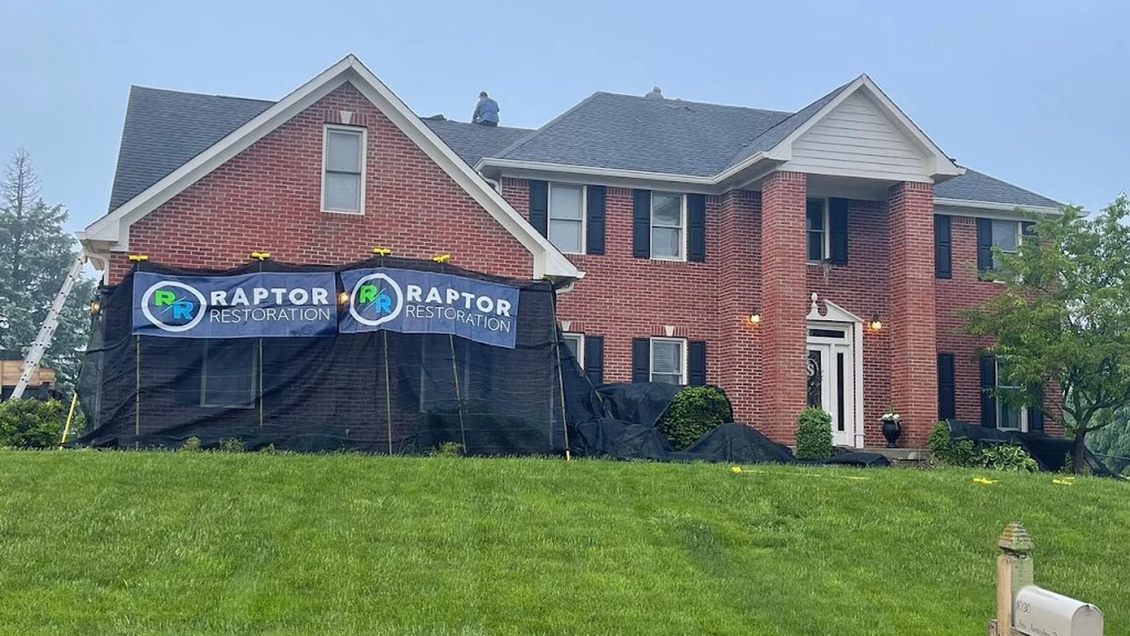 Finished Homes
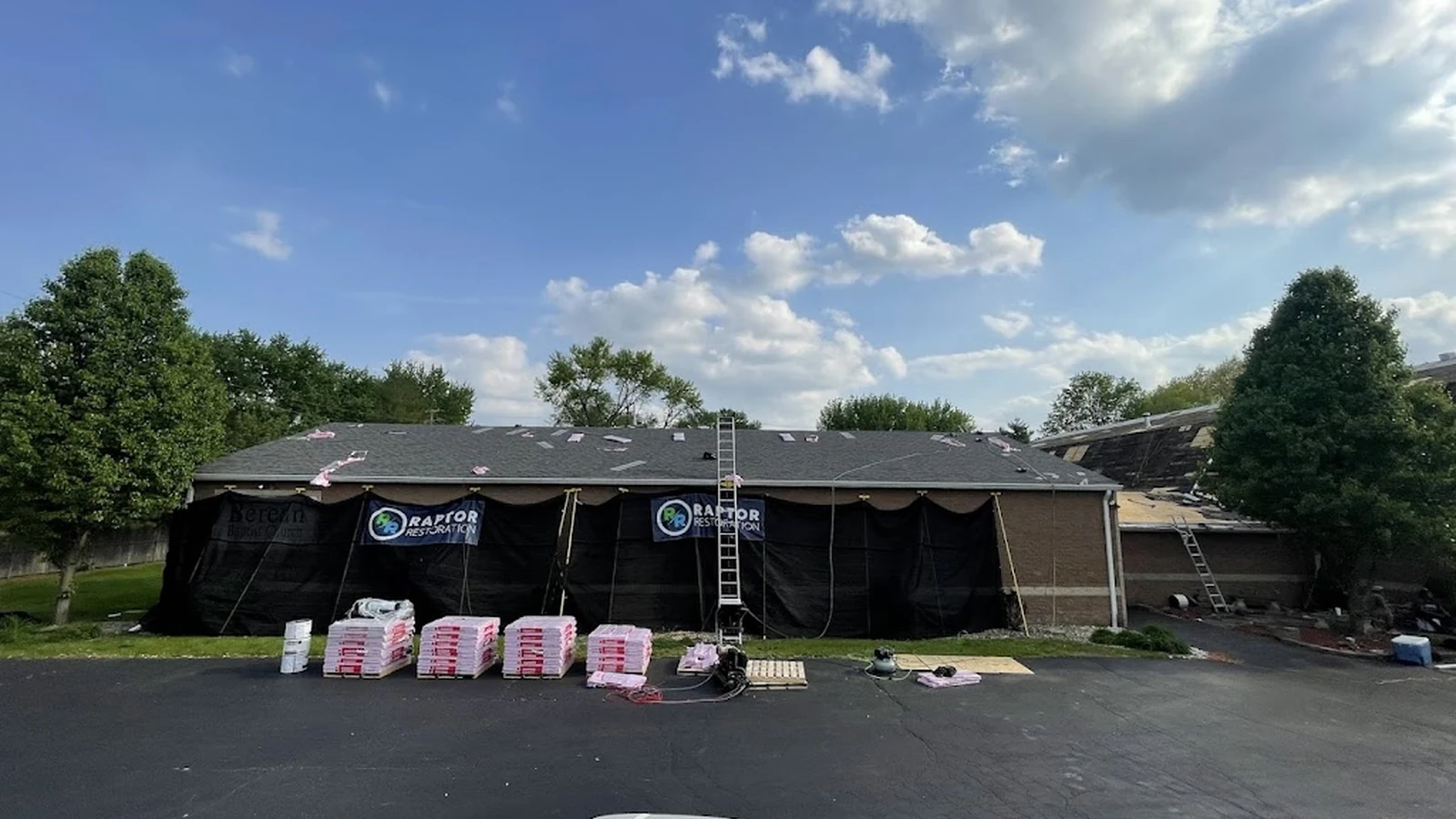 Commercial Capability
Should show real homes, trucks, crews, or finished projects. Avoid dark overlays that hide the project.
Use material closeups, installation details, gutter profiles, siding textures, and roof system layers to support deeper education.
Show faces, roles, events, crew culture, and the people a homeowner may actually talk to.
Links and actions
Raptor Brand Kit reviews CTAs for clarity. If a button is vague, the page is not finished. Primary actions lead to inspection, call, quote, review, or service exploration.
Theme rules
Raptor can feel storm-ready, premium, commercial, educational, or team-focused while still using the same brand spine.
Use for Home, Contact, Team, and Service Areas. Lead with clarity, process, reviews, and local presence.
Use for metal roofing, stone-coated steel, Hardie siding, windows, and exterior upgrades. Lead with fit, durability, and design value.
Use for active leak, hail, wind, and emergency content. Keep the tone calm and practical. Orange can support urgency.
Use for low-slope, retail, office, church, and property-owner content. Lead with reporting, risk, access, and continuity.