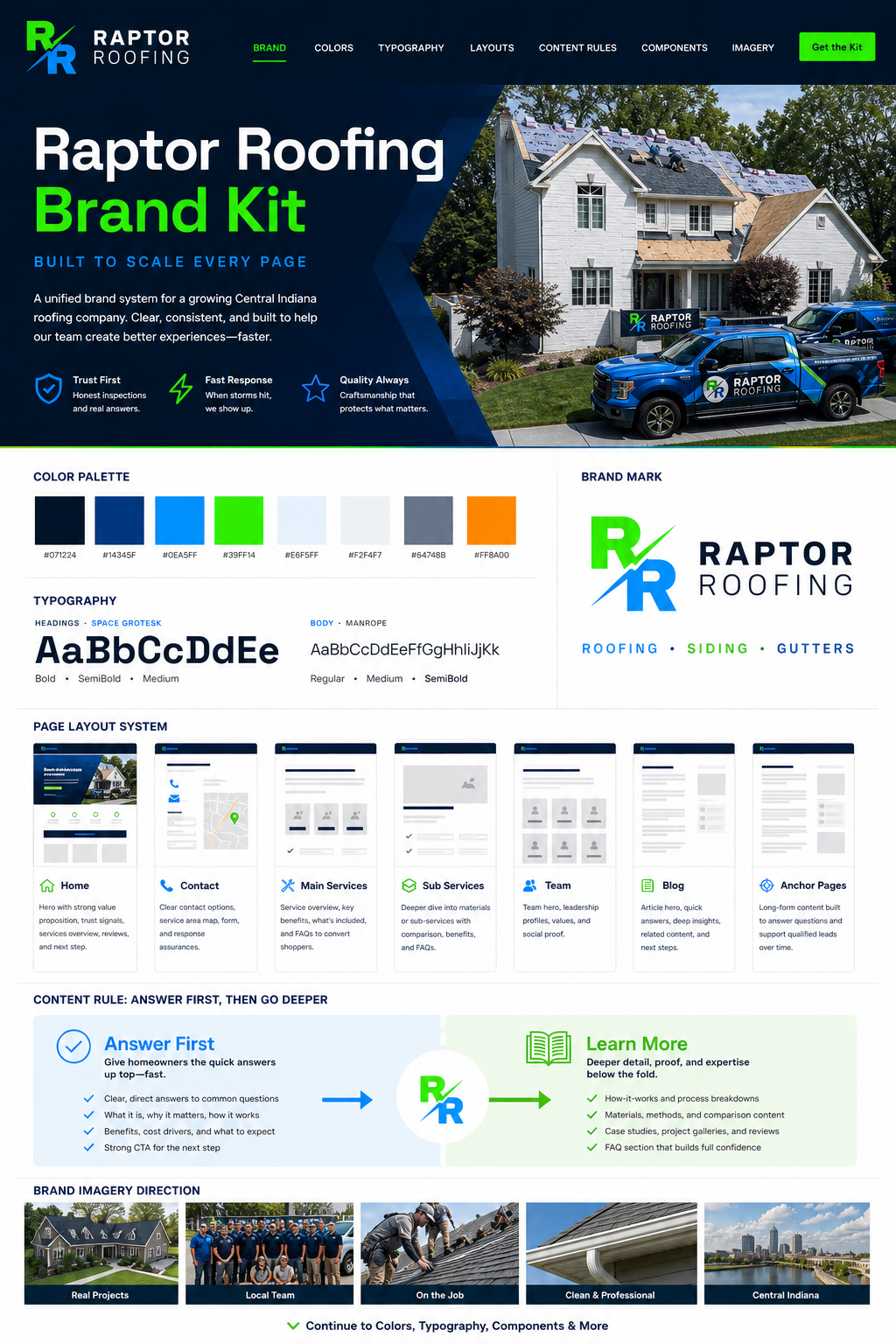
Visual identity
Navy, blue, green, white, squared cards, strong headings, real Raptor imagery, and clean mobile structure.
Creative Review
This workspace shows how Raptor can review page sections, social posts, ad ideas, video concepts, and generated creative ideas against the Brand Kit. Each decision becomes reusable guidance for the next creator.
Brand Kit snapshot
Visual Standard reviews visual identity and voice. Message Clarity reviews offer clarity and next-step strength. Proof Review handles claim-sensitive language before it becomes approved brand truth.
Navy, blue, green, white, squared cards, strong headings, real Raptor imagery, and clean mobile structure.
Practical, calm, specific, local, and useful. No scare tactics, vague hype, or generic contractor filler.
Every asset should make the next action clear: book, call, compare, read, or review.
Reviews, guarantees, price, credentials, and performance claims move through Proof Review.
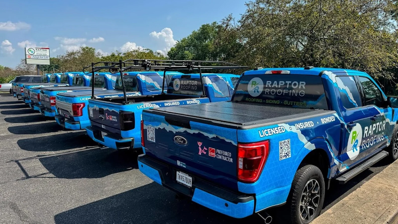
Strong brand recognition, real local proof, clear first-viewport trust, and strong fit for a scaling contractor. This should be an approved example for homepage and contact-page hero imagery.
Excellent brand continuity. The trucks make Raptor instantly recognizable.
Works best when paired with a direct inspection CTA and phone option.
Save as an approved hero image direction.

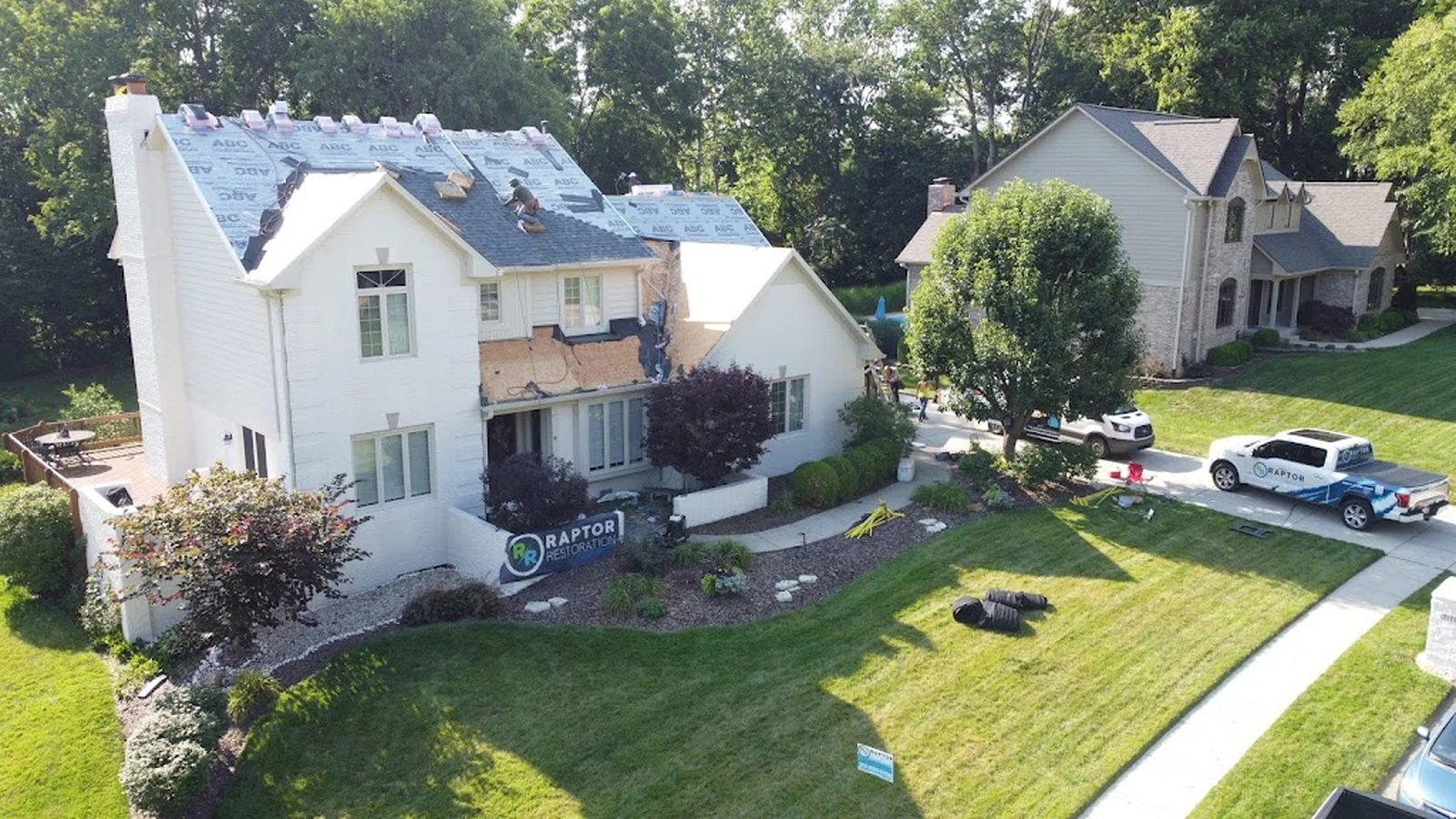
Strong fit for premium sub-service pages. The image supports deeper material education while still showing real installation context.
Good texture and craft signal. Use with clean white page sections.
Add a fit guide so homeowners understand when metal roofing is worth discussing.
Approved for material pages with comparison copy.
The visual direction uses the right colors but the tone is too alarm-heavy and the copy leads with fear instead of practical guidance. It should be revised before becoming a reusable example.
Color is close, but the composition feels more like an ad than Raptor's service experience.
The offer is unclear. Replace pressure language with a calm inspection path.
Reject as a standard. Keep only the bold color contrast.
The image is strong, but the claim needs verified approval before it can be used. Speed, guarantee, and response claims should not become brand guidance without proof.
Visual identity works. The project image feels credible and local.
The CTA can work, but the promise is too strong without verification.
Route the claim before publishing or replace with calmer wording.
Decision memory
Approved and rejected examples make the next creative handoff faster. A designer can see what the company means by premium, local, storm-ready, commercial, and homeowner-first.
Hero images, CTA sections, service page modules, team blocks, and social posts that match the system become references.
Almost-right work should keep the useful piece and explain exactly what needs to change.
Risky claims become proof review items so future creators know the boundary.